What Is a DateTimePicker?
A DateTimePicker allows the user to select dates and times.
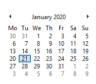
An example of a DateTimePicker in action is shown in Figure 1.
Figure 1: Change computer date
You will see that the DateTimePicker has many faces, all of which depend on the various properties you can set.
Using the DateTimePicker
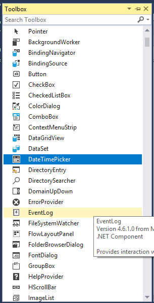
Let’s create a Windows Forms application with at least one form. When the form has loaded, you can have a look in the toolbox for the DateTimePicker. The Toolbox is shown in Figure 2.
Figure 2: Toolbox
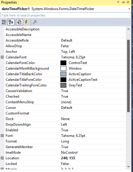
Once the DateTimePicker has been added, you may notice the Properties window, as shown in Figure 3. This is where we set the DateTimePicker’s properties.
Figure 3: Properties Window
Apart from the ordinary properties, such as Anchor, Dock, and Location, here are a few cool properties to look out for.
Cool DateTimePicker Properties
The following properties control how the ListBox work and how it appears:
- MaxDate/MinDate
- Value
- Calendar Properties:
- Font
- ForeColor
- MonthBackground
- TitleBackColor
- TitleForeColor
- TrailingForeColor
- ShowCheckBox
MaxDate/MinDate
The DateTimePicker.MaxDate property gets the maximum date value allowed, which is December 31, 9998. The DateTimePicker MinDate property gets the minimum date value allowed, which is January 1, 1753.
Here is a coding example:
   private void button1_Click(object sender, EventArgs e)
   {
      MessageBox.Show(dateTimePicker1.MaxDate.ToLongDateString());
   }

   private void button2_Click(object sender, EventArgs e)
   {
      MessageBox.Show(dateTimePicker1.MinDate.ToLongDateString());
   }
Value
Gets or sets the date or time value of the DateTimePicker.
Here is a coding example:
   private void button3_Click(object sender, EventArgs e)
   {
      MessageBox.Show(dateTimePicker1.Value.ToLongDateString());
   }
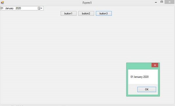
Assuming a date value of 1 January 2020 was selected, the MessageBox would show the following (see Figure 4):
Figure 4: Get Value
Calendar Properties
- Font
- ForeColor
- MonthBackground
- TitleBackColor
- TitleForeColor
- TrailingForeColor
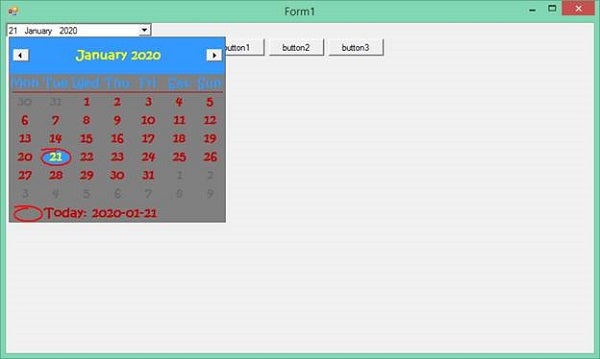
The following properties apply to the Calendar part of the DateTimePicker control.
- CalendarFont: The calendar’s font.
- CalendarForeColor: The calendar’s foreground color.
- CalendarMonthBackground: The calendar month’s background color.
- CalendarTitleBackColor: The calendar title’s background color.
- CalendarTitleForeColor: The calendar title’s foreground color.
- CalendarTrailingForeColor: The calendar trailing date’s foreground color.
Figure 5 shows the DateTimePicker when some of these properties are applied.
Figure 5: Calendar Properties
You may not see the design changes when you run your program. This is because, when the DateTimePicker control was added to the form, it already assumed the current Windows’ version theme and applied it by default. To bypass this, you need to comment out a line in your Program.cs file, as shown below:
   static void Main()
   {
      // Application.EnableVisualStyles();
      Application.SetCompatibleTextRenderingDefault(false);
      Application.Run(new Form1());
   }
ShowCheckBox
If set to true, it adds a checkbox to the left of the selected date. When selected, the date/time value can be changed. Otherwise, the date/time value cannot be changed.
Here is a code example:
   private void button4_Click(object sender, EventArgs e)
   {
      dateTimePicker1.ShowCheckBox = true;
   }
Conclusion
I hope that this article has helped you understand the intricacies of a DateTimePicker. I would love to do more articles on the basics of controls, so hopefully there will be more.


